In previous posts, I have been insistent about the main objective of visual design is communication. However, two routes can be taken for your business depending on what you want to achieve, you can persuade and you can inform.
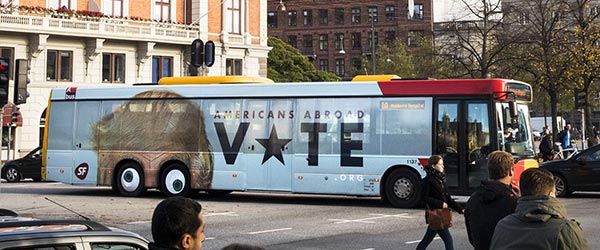
For example, designing for advertising seeks to persuade your audience to take an action. But when it is designed to inform, seeks to provide information to a group of people so they can make the most appropriate action for themselves within their context.
Is not that one is against the other, but we should analyze which one should weigh more according to each project. In both cases, it is about triggering an action, but with a different purpose. Let’s see a little more of each of these terms.
Persuasive Design.
As I mentioned, it attempts to generate an action in a determined audience.
We try to achieve this through psychological, social, and anthropological tools, among others, to produce emotions and influence behavior. It is very clear the role of emotions to get human beings to make decisions. In this case, the information alone is not enough.

Empathy with your audience is one of the best ways to influence because it is about them to feel identified with what you offer, it’s about understanding them, and not vice versa. Do not pretend they understand you or your product.
Information Design
When I talk about Information Design, I mean seeking to inform rather than persuade.
Actually, both persuasive design and information design work with information. But as you have already seen, they look for different objectives.

The Information design seeks to translate complex data into easy and quick to understand information to guide you to take an action.
Elements and visual variables are used such as shapes, orientation, size, colors, textures, position, etc. to synthesize the message, you want to send.
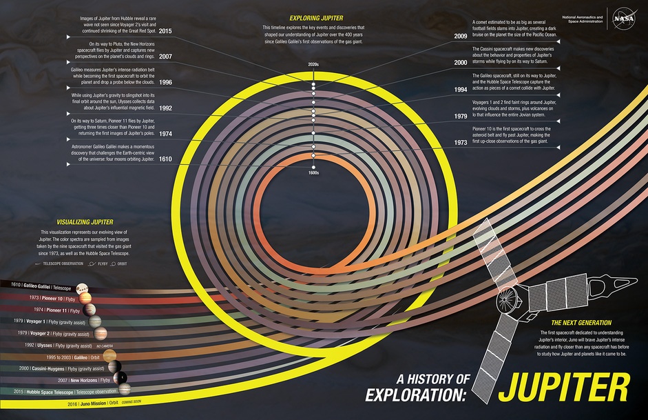
You can see examples of information design in the signage of a museum, in an infographic, in a weather map, or the charts of a financial report, among many other examples.

It’s another classic example of information design.
Something else about information design is that it does not have to be boring. Part of the objective, to a greater or lesser extent and depending on each case, is to make it visually attractive. Infographics are an excellent example in which the information can be pleasing to the eye despite the possible complexity of the subject.

With the arrival of the internet and mobile apps, this discipline has thrived due to the need to create simple and easy to understand visual interfaces despite the complexity involved.
Take the app from your bank as an example. If it is well designed, it is easy to navigate through it that makes invisible to you all the intricacies involved in the information, data, and security it has.
This brings me to the invisibility of the design. In part, the design suffers by its own success, if a design is well done, it is invisible to the user, he does not notice it.
In most cases, people notice the design when it is badly done. But when it is simple and easy to understand, it is common to keep the idea that designing it was also easy, simple, and fast, when the reality was different.
But about the invisibility of the design, I will speak in another post.
I hope you have found this text interesting and useful. Leave your comments below, and if you are interested in talking about the visual communication needs of your business, contact me.
Your logo and your website are the face of your business. Thinking about design is not thinking only on lines, shapes or colors; is to think about showing you are professional, reliable and likable.
When the time comes and you need a designer, send me a message. I will be glad to assist.
- Mario
